Custom Texture Thread.
Forum rules
Before posting your Resource, please make sure you can answer YES to any of the following questions:
Consult the Resource/Request Posting Guidelines for more information.
Please don't put requests here! They have their own forum --> here. Thank you!
Before posting your Resource, please make sure you can answer YES to any of the following questions:
- Is the resource ENTIRELY my own work?
- If no to the previous one, do I have permission from the original author?
- If no to the previous one, did I put a reasonable amount of work into the resource myself, such that the changes are noticeably different from the source that I could take credit for them?
Consult the Resource/Request Posting Guidelines for more information.
Please don't put requests here! They have their own forum --> here. Thank you!

Re: Custom Texture Thread.
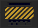
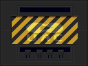
Hmm, the trouble with these is that the per-brick gradienting is too heavy. It makes them look unnaturally rounded, which also makes the PLAT1 edit above look a bit odd. It's like the front panel is a bit of warped aluminum sheet metal that's sticking out toward the player. 
Re: Custom Texture Thread.
They certainly look rounded, which could make them useful textures if that's what you're trying to convey.

Re: Custom Texture Thread.
Well it looks equally silly to just have no bordering on the door whatsoever.Xaser wrote:the PLAT1 edit above look a bit odd. It's like the front panel is a bit of warped aluminum sheet metal that's sticking out toward the player.

Re: Custom Texture Thread.
Wow! Not only the textures I asked about but additional variations and a whole bunch of other stuff too. It all looks great and I love the lift/platform textures. Phenomenal!
I see what Xaser is saying about the bending effect. I noticed on the BIGDOOR texture too. Hang on, I need to mirror that stuff here...
Blox's stuff, not mine...


However, I personally don't mind the effect and I think the textures look great in game.
BTW, I hadn't noticed the updated space door. I like it too.
I see what Xaser is saying about the bending effect. I noticed on the BIGDOOR texture too. Hang on, I need to mirror that stuff here...
Blox's stuff, not mine...
However, I personally don't mind the effect and I think the textures look great in game.
BTW, I hadn't noticed the updated space door. I like it too.
-
FuzzballFox

- Posts: 1905
- Joined: Thu Jan 24, 2008 10:19 am
- Location: Hampshire UK
Re: Custom Texture Thread.
Makes we wonder how that kind of look would work on some of the COMP textures...
I have a COMP style door I'm happy to donate~ C:
I have a COMP style door I'm happy to donate~ C:
Re: Custom Texture Thread.
Very nice and yet, not so much. Th idea is nice, the work is nice but the problem (IMO of course) is the source material. Those grey computer panels just being blocks of a single colour doesn't look good. Adding even a little bit of random noise improves things IMO. Of course, if you are doing that, then it makes sense to do it foe all the textures with a similar solid-grey appearance. I think NiGHTMARE did it for most, if not all, the computer textures in KDiZD. Anyway, here is just a quick "proof of concept" version to show what I mean...


I think the "random noise" in that is only the background grey plus one other but I think it improves things quite a bit
I think the "random noise" in that is only the background grey plus one other but I think it improves things quite a bit
-
NeuralStunner
-

- Posts: 12328
- Joined: Tue Jul 21, 2009 12:04 pm
- Preferred Pronouns: No Preference
- Operating System Version (Optional): Windows 11
- Graphics Processor: nVidia with Vulkan support
- Location: capital N, capital S, no space
- Contact:
Re: Custom Texture Thread.
I'd like to request extra versions of the door-with-light, having the light turned off.Blox wrote:

Maybe I could do that myself, but they're not my edits to start with.
-
FuzzballFox
- Posts: 1905
- Joined: Thu Jan 24, 2008 10:19 am
- Location: Hampshire UK
Re: Custom Texture Thread.
Oooh looks nice~Enjay wrote:Very nice and yet, not so much. Th idea is nice, the work is nice but the problem (IMO of course) is the source material. Those grey computer panels just being blocks of a single colour doesn't look good. Adding even a little bit of random noise improves things IMO. Of course, if you are doing that, then it makes sense to do it foe all the textures with a similar solid-grey appearance. I think NiGHTMARE did it for most, if not all, the computer textures in KDiZD. Anyway, here is just a quick "proof of concept" version to show what I mean...
I think the "random noise" in that is only the background grey plus one other but I think it improves things quite a bit
Re: Custom Texture Thread.
I'm not quite sure what is going on with the central panel in this one:

I looked at the Doom original, and it didn't make things much, if any, clearer:

I *think* that the central area is supposed to be quite flat with a slightly arker rectangle outline on it. I think that most of the darker areas are supposed to be staining of some sort. That, unfortunately, looks odd and creates a slight 3D effect that I don't think should be there and this is enhanced by Blox's shading. So, I've had a little go at flattening out the central section. It's not perfect but I do think it makes it closer to what I think the central area is meant to look like.

Or a simpler approach which only involes removing a little of the detail from the other one. It means that there are indents in the middle that are clearly not there on the Doom original but I quite like how it looks anyway.

As for a "light off" version of the lit door thingy, I submit further evidence as to why I teach biology and not art.


I looked at the Doom original, and it didn't make things much, if any, clearer:
I *think* that the central area is supposed to be quite flat with a slightly arker rectangle outline on it. I think that most of the darker areas are supposed to be staining of some sort. That, unfortunately, looks odd and creates a slight 3D effect that I don't think should be there and this is enhanced by Blox's shading. So, I've had a little go at flattening out the central section. It's not perfect but I do think it makes it closer to what I think the central area is meant to look like.
Or a simpler approach which only involes removing a little of the detail from the other one. It means that there are indents in the middle that are clearly not there on the Doom original but I quite like how it looks anyway.
As for a "light off" version of the lit door thingy, I submit further evidence as to why I teach biology and not art.
-
FuzzballFox
- Posts: 1905
- Joined: Thu Jan 24, 2008 10:19 am
- Location: Hampshire UK
Re: Custom Texture Thread.
Light one looks good~
You could randomise the texture and light change, have it malfunction and flicker.
You could randomise the texture and light change, have it malfunction and flicker.
Re: Custom Texture Thread.
Thanks. 
I tried to make coloured versions of the big door but they look too much like exactly what I did - just washed them over with a colour (expecially the brown one).


I also made them dirty again.


I think the brown one looks better this time.
I tried to make coloured versions of the big door but they look too much like exactly what I did - just washed them over with a colour (expecially the brown one).
I also made them dirty again.
I think the brown one looks better this time.
Re: Custom Texture Thread.
It looks much better tan than brown, yeah.
As for that central indent, well - I was pretty much rushing it all, and I have no idea what's really going on in those doors.
(The corrected one looks cheesegrate though.)
As for that central indent, well - I was pretty much rushing it all, and I have no idea what's really going on in those doors.
(The corrected one looks cheesegrate though.)
Re: Custom Texture Thread.
Blox wrote:(The corrected one looks cheesegrate though.)
A second attempt at a brown door...

1st attempt then 2nd attempt


Re: Custom Texture Thread.
Yup, better than mine.Blox wrote:Hm?
While you were doing that, I was...


Again, better than my first attempts but not as good as your colouring.