Page 2 of 3
Posted: Mon Sep 05, 2005 2:44 pm
by ace
Nice! *saves*

Any other takers?

Posted: Mon Sep 05, 2005 2:45 pm
by jallamann
Posted: Mon Sep 05, 2005 2:47 pm
by BouncyTEM
ooh! nice!
Posted: Mon Sep 05, 2005 2:49 pm
by ace
These are great! Any others?
Posted: Mon Sep 05, 2005 3:00 pm
by BouncyTEM
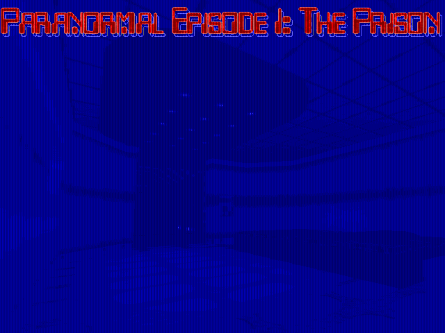
I made another. this one has a more computer-y feel to it, although due to the way Doom likes blues, the background didn't come out perfect.

Posted: Mon Sep 05, 2005 3:02 pm
by ace
Ah, I forgot that Doom doesn't like stuff blue. :/
I guess orange is the color I'm going for, then... hm, which to choose?

Posted: Mon Sep 05, 2005 3:05 pm
by BouncyTEM
Updated my 2nd one.
Made the text stand out better, making it easier to read.
also did the same filter on it seperately, making it seem far more computer-ish
Posted: Mon Sep 05, 2005 3:07 pm
by HobbsTiger1
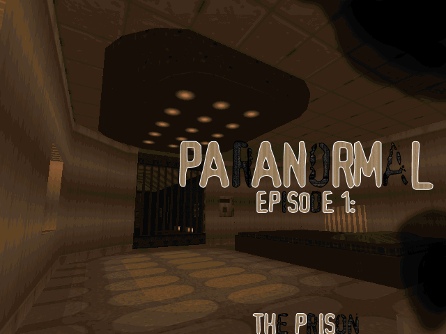
Yes, not as good, I can change it a bit, but basically heres my design concept.
Posted: Mon Sep 05, 2005 3:07 pm
by Enjay
ace wrote:It is 640*480.
Yeah, I meant keep it that way. Don't reduce it to 320x200 like a lot of people seem to think titlepics need to be.
Posted: Mon Sep 05, 2005 3:10 pm
by ace
Hrm... I'm starting to think the second one would fit better with Episode II or III, which have a more computer-tech theme than this one.
As for a choice... hm...
EDIT:
@Hobbs: good, but too dark.
@Enjay: Don't worry, I never planned on changing it to a lower-res.
Posted: Mon Sep 05, 2005 3:13 pm
by Phobus
Aside from Hobbs' being too dark, I'd say we have three real contenders here:
Jalla's one
Bouncy's first one
Hobbs' one
Posted: Mon Sep 05, 2005 3:19 pm
by BouncyTEM
here's a 3rd I did. just testing out.
and i'm bored!
Posted: Mon Sep 05, 2005 3:21 pm
by HobbsTiger1
Phobus, mines not even mapped to the Doom Palette. It's a concept that I could do a working TITLEPIC off of. I can do this sort of thing in about 3 minutes in photoshop if I have to (take an image, apply a few filters, and some text, blur, brushing, etc.) and did it just to see what he thought of the concept.
@Bouncy: Yours isn't mapped to the Doom pallete either.
Posted: Mon Sep 05, 2005 3:22 pm
by ace
Yep. Right now I'm leaning a bit towards Jalla's one, though Bouncy's and Hobbs's are good as well.
As you might be able to tell I'm not a very decisive (spelling?) person.
EDIT:
And damnit, I'm a slow poster too.
@ Bouncy: ANOTHER ONE?! Now I'll never come to a decision! Just kidding, it's nice though the letters that are changed could be brighter.
@ Hobbs: I like the concept enough although it would help to have an "Episode I: The Prison" included.
Posted: Mon Sep 05, 2005 3:26 pm
by BouncyTEM
ace wrote:Yep. Right now I'm leaning a bit towards Jalla's one, though Bouncy's and Hobbs's are good as well.
As you might be able to tell I'm not a very decisive (spelling?) person.
EDIT:
And damnit, I'm a slow poster too.
@ Bouncy: ANOTHER ONE?! Now I'll never come to a decision! Just kidding, it's nice though the letters that are changed could be brighter.
@ Hobbs: I like the concept enough although it would help to have an "Episode I: The Prison" included.
Gotcha
BTW, Hobbs' does has Episode I: The Prison. it's at the bottom right.
