The WIP Thread
-
Viscra Maelstrom

- Posts: 6200
- Joined: Thu Dec 04, 2008 1:14 am
- Location: plergleland
-
Salad Viking

- Posts: 752
- Joined: Tue Apr 20, 2010 8:58 pm
- Location: In high orbit
Re: WHAT THE HELL are you working on (WIP THREAD not gossip)
Oh.. my... Lord...Pyroscourge wrote:Images
Those are some of the best looking screenshots I've ever seen in Doom. It's just like a T667 wad, only good looking!
-
esselfortium

- Posts: 3862
- Joined: Tue Sep 19, 2006 8:43 pm
- Contact:
Re: WHAT THE HELL are you working on (WIP THREAD not gossip)
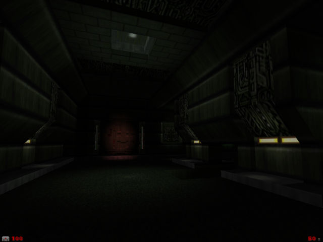
IMO it just looks alright.Pyroscourge wrote:Spoiler:


I don't much like the snow textures, at least not for covering such large spaces, and the lighting indoors looks like a billion and a half other GZDoom maps I've seen. Dark rooms with tons of glowy lights that don't seem to brighten much of anything but themselves. It could be interesting if you created some actual large-scale light variation, with significant areas brightened and darkened rather than just depending on the lightbulbs themselves and the midtex glows to create contrast. Right now it's just dark for the sake of dark; proper contrast within areas can make it moody. I'm really not feeling the atmosphere as-is.


Re: WHAT THE HELL are you working on (WIP THREAD not gossip)
I love it and I want to see it finished.  That outside area looks extremely well done - that skybox adds so much more depth to the surroundings.
  I will say, though, that the second inside shot does the architecture (which looks very well done) no justice - it's too dark to see much of it. Do consider expanding the lighter areas.
-
.+:icytux:+.

- Posts: 2661
- Joined: Thu May 17, 2007 1:53 am
- Location: Finland
Re: WHAT THE HELL are you working on (WIP THREAD not gossip)
@Pyroscourge: Why do you hide that nice architecture with darkness? come on, show it more and lighten it up, as essel said, it dosn't make sense when theres loads of ceiling lights, but nothing actually gets lit up by them.
-
Pyroscourge
- Posts: 126
- Joined: Thu Sep 30, 2010 2:04 am
- Location: Australia
Re: WHAT THE HELL are you working on (WIP THREAD not gossip)
Thank you for the comments, even if some are slightly overzealous.
You raise an interesting point Esselfortium, although I am not sure the best way to go about this. I am sure it would look excellent with static lighting increases to the areas that appear to require it. But, with the current design of the map adding in extra lighting sectors becomes very difficult, mainly because it messes with the architecture. I am sure using Dynamic Lights as an alternative is out of the question, as when they are largely scaled they work horribly with such complicated rooms as in the second indoor screenshot. However, I do see what you mean, and I will see what I can do about it.
You raise an interesting point Esselfortium, although I am not sure the best way to go about this. I am sure it would look excellent with static lighting increases to the areas that appear to require it. But, with the current design of the map adding in extra lighting sectors becomes very difficult, mainly because it messes with the architecture. I am sure using Dynamic Lights as an alternative is out of the question, as when they are largely scaled they work horribly with such complicated rooms as in the second indoor screenshot. However, I do see what you mean, and I will see what I can do about it.
-
esselfortium
- Posts: 3862
- Joined: Tue Sep 19, 2006 8:43 pm
- Contact:
Re: WHAT THE HELL are you working on (WIP THREAD not gossip)

Design exercise of the day, because I need to extend my skills to web design sooner or later.
-
Salad Viking
- Posts: 752
- Joined: Tue Apr 20, 2010 8:58 pm
- Location: In high orbit
Re: WHAT THE HELL are you working on (WIP THREAD not gossip)
I couldn't disagree more with essel. I love the high contrast between light and dark. If you brightened up the areas, it would make them look rather grey and dull and washed-out. When you have dark areas with specific bright and colorful areas, they sort of "pop." The high-contrast, color-on-black art style certainly isn't for everyone - it's sort of postmodern - but I enjoy it a lot.
-
esselfortium
- Posts: 3862
- Joined: Tue Sep 19, 2006 8:43 pm
- Contact:
Re: WHAT THE HELL are you working on (WIP THREAD not gossip)
The high contrast isn't the problem, though. It's the fact that the contrast is entirely between the bright bulbs and the dark everything else. You could maintain a high-contrast appearance without taking the easy (or, at least, easy-looking because so many GZDoom maps do it) route. Dim rooms with sharp, imposing shadows and scattered spots of brightness not only provide more contrast and complexity than what the map currently shows, but also means you can actually see what you're shooting at. Which is arguably more important than looking cool, anyway.
-
Tormentor667

- Posts: 13556
- Joined: Wed Jul 16, 2003 3:52 am
- Preferred Pronouns: He/Him
- Operating System Version (Optional): Windows 11
- Graphics Processor: nVidia (Modern GZDoom)
- Location: Germany
- Contact:
Re: WHAT THE HELL are you working on (WIP THREAD not gossip)
I'd also suggest reducing the amount of visibility of these light-gradients

Re: WHAT THE HELL are you working on (WIP THREAD not gossip)
I like the "snow", looks like ash.

Re: WHAT THE HELL are you working on (WIP THREAD not gossip)
Evangelion?esselfortium wrote:
Design exercise of the day, because I need to extend my skills to web design sooner or later.

Re: WHAT THE HELL are you working on (WIP THREAD not gossip)
Something to be released in the distant future.
Spoiler:

Re: WHAT THE HELL are you working on (WIP THREAD not gossip)
@DoomAD: Your screenshots reminds me of DOOM³ (which is a good thing), good work by the way
@Pyroscourge: *eyegasm* Holy christ, how many time you spend doing that rooms? (especially the outdoor areas)
@Pyroscourge: *eyegasm* Holy christ, how many time you spend doing that rooms? (especially the outdoor areas)

Re: WHAT THE HELL are you working on (WIP THREAD not gossip)
I like that essel. What would that be, a forum skin?